Who’s got the best fit on the biggest stage? Ranking World Baseball Classic uniforms
Who’s got the best fit on the biggest stage? Ranking World Baseball Classic uniforms
The World Baseball Classic represents the pinnacle of international baseball, a stage where nations collide to determine global supremacy. However, beyond the home runs and high-velocity fastballs, there is another competition taking place: the battle for aesthetic dominance. When the 2026 World Baseball Classic begins, fans will be scrutinizing every jersey, cap, and sock pattern to see who has successfully blended national heritage with modern athletic design. This ranking dives deep into the threads of the tournament, evaluating which teams have struck gold with their attire and which ones strike out looking. From the iconic pinstripes of Japan to the vibrant, experimental greens of Mexico, we analyze the visual identity of the world's greatest baseball nations.
The best uniforms in the World Baseball Classic are those that effectively integrate national flag colors, cultural symbols, and unique typography without appearing cluttered. Currently, Mexico is widely considered to have the best fit due to its distinctive green and red color scheme and unique 1968 Olympics-inspired font. Japan follows closely with its timeless pinstriped home whites that evoke a sense of tradition and excellence. Conversely, teams like Great Britain and Canada have faced criticism for designs that feel either too simplistic or lack a cohesive national identity compared to their peers on the world stage.
The Top Tier: Mexico's Distinctive Visual Identity
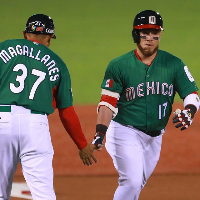
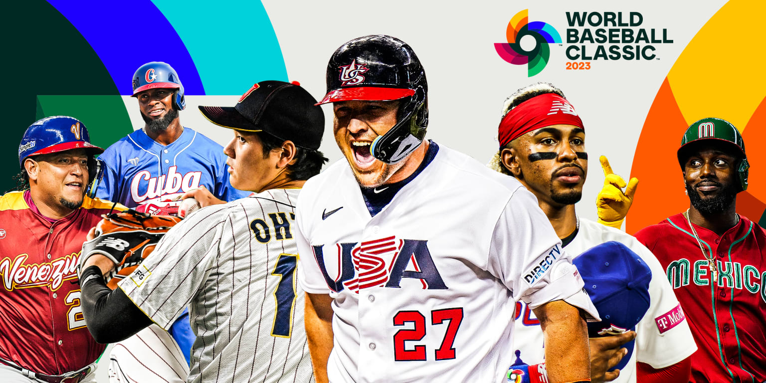
Mexico consistently sits at the top of many uniform rankings for a very simple reason: they own their look. While the tournament is often flooded with various iterations of red, white, and blue, Mexico leans into a vibrant forest green that immediately distinguishes them from the competition. Their uniforms frequently utilize a font inspired by the 1968 Mexico City Olympics, which provides a deep historical connection to the country’s sporting heritage. The use of red as an accent color against the green provides a high-contrast look that pops on high-definition broadcasts, making them the gold standard for WBC fits.
Tradition Meets Excellence: Japan’s Classic Samurai Aesthetic
Japan, or Samurai Japan, is the only major nation in the tournament not using Nike-produced jerseys, opting instead for Mizuno. This independence allows them to maintain a look that feels specifically tailored to Japanese baseball culture. Their home white pinstripes are legendary, offering a clean, professional aesthetic that mirrors the disciplined and fundamental style of play the team is known for. The recent additions of gold detailing and subtle gradients on away uniforms have modernized the look without sacrificing the "elder statesman" vibe that makes Japan look like a powerhouse before they even take the field.
The Rising Power of the Caribbean: Venezuela and the Dominican Republic
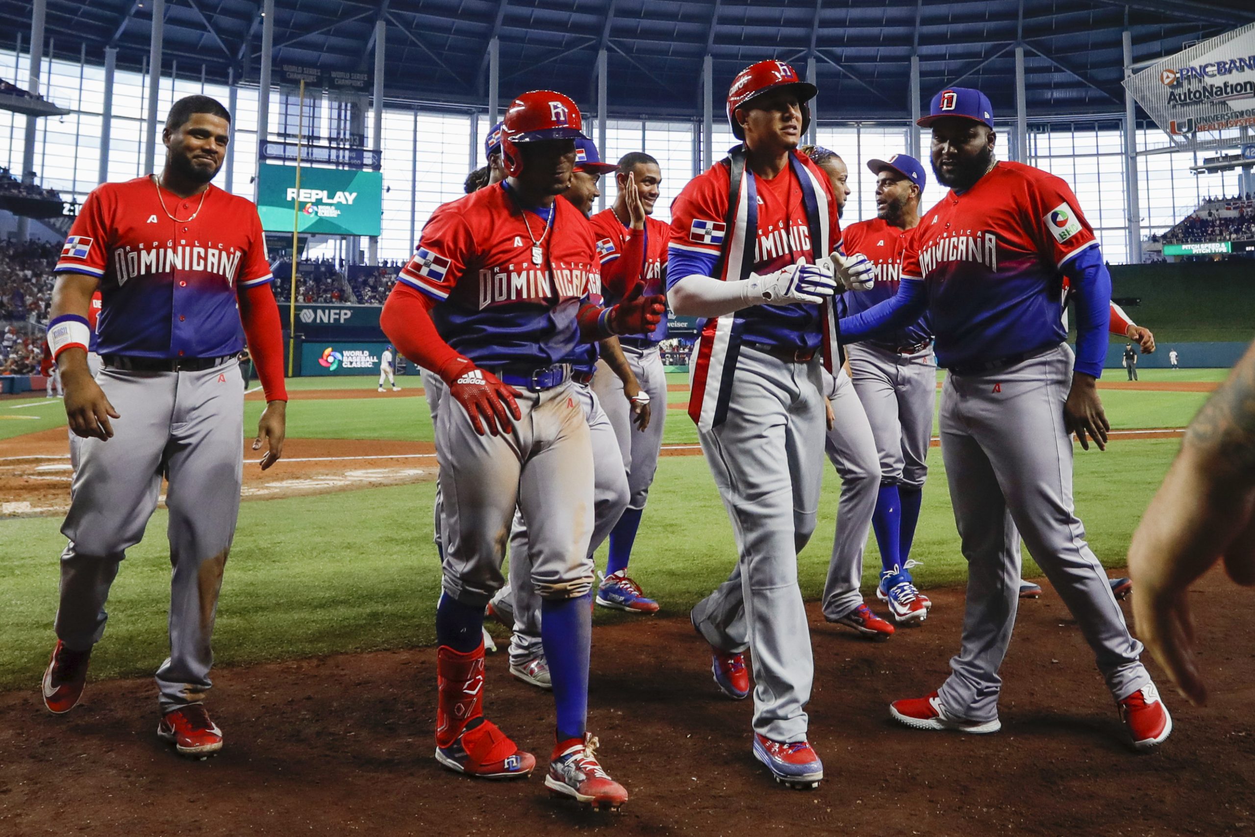
Venezuela has recently made significant strides in their uniform design. Traditionally relying on a color palette of blue, red, and yellow, their latest iterations have experimented with bold, mid-century lettering and striking color combinations. The "blue and gold" look is particularly celebrated for being both adventurous and sophisticated. Similarly, the Dominican Republic balances classic baseball elements with cultural pride. Their use of vibrant reds and deep blues, often accompanied by elegant script lettering, reflects the island's passionate connection to the game. When the DR takes the field, their uniforms exude the confidence of a nation that produces some of the world's most elite talent.
Analyzing the Host Nation: Team USA’s Mixed Reviews
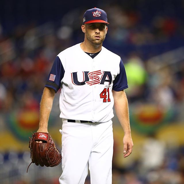
Team USA is always under the microscope. Their uniforms are meant to represent the birthplace of baseball, yet they often receive mixed reviews. While the classic red, white, and blue color scheme is untouchable, critics often point to the typography and logo design as being somewhat "generic" or "corporate." The most praised element of the current USA kit is the "S" in the USA wordmark, which is designed to mimic the waving stripes of the American flag. However, compared to the creative risks taken by Mexico or the traditional elegance of Japan, Team USA often finds itself in the middle of the pack aesthetically.
Middle of the Pack Aesthetics
| Country | Design Rating |
|---|---|
| Netherlands | Very High (Crown Detail) |
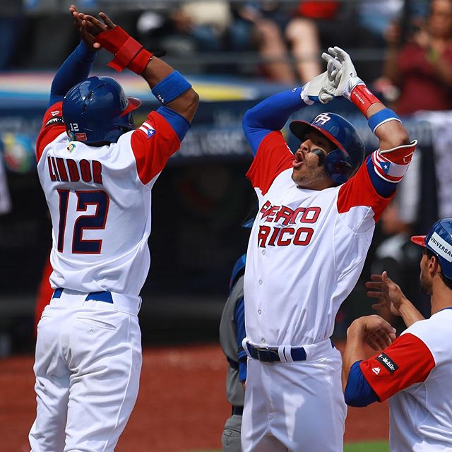
| Puerto Rico | High (Classic Blue/Red) |
| Australia | Moderate (Unique Colors) |
| South Korea | Moderate (Modern Font) |
The Pinstripe Renaissance: Netherlands’ Subtle Evolution
The Netherlands has moved away from the heavy use of orange—the national color—in their primary game sets, opting instead for a more refined navy and white pinstripe look. The standout feature of the Dutch uniform is the inclusion of the "Kingdom of the" text surrounding a crown, a nod to their monarchical status. This artistic flourish adds a touch of nobility to the jerseys. While some fans miss the vibrant orange, the shift to pinstripes has given the Netherlands a more formidable, professional appearance that stands up well against the MLB-style uniforms of their opponents.
The Conflict of Colors: Italy and the Blue Tradition
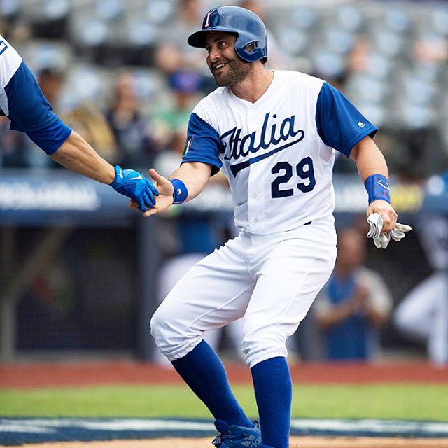
Italy presents a unique case in international sports. While their flag is green, white, and red, their national teams across all sports—most notably soccer—compete in "Azzurro" blue. This can be confusing for casual viewers who expect to see the colors of the tricolor flag. In the WBC, Italy’s uniforms often mirror the classic look of the Los Angeles Dodgers, emphasizing a clean blue script on a white background. While the look is undeniably stylish, it suffers from a lack of "national identity" in its color palette, frequently landing it lower on lists that prioritize flag representation.
Room for Improvement: Canada and Great Britain
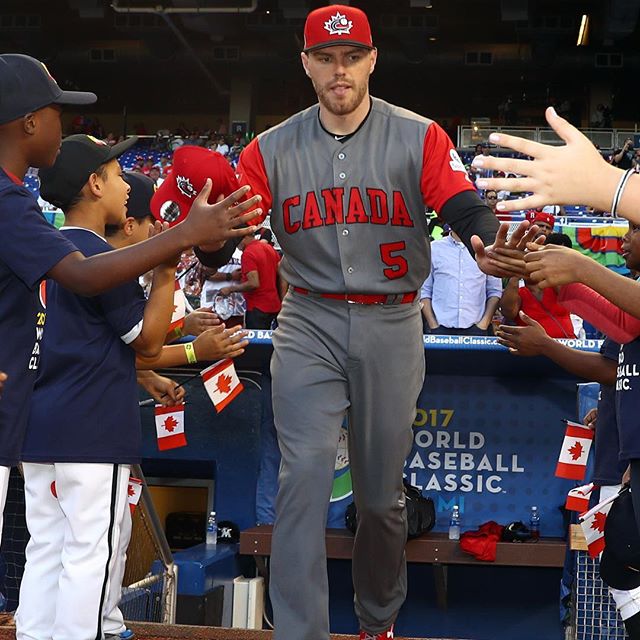
Not every uniform can be a home run. Canada has struggled with designs that fans find either too simplistic or marred by clashing elements. The 2023 "unfinished" stripes were a major point of contention, leading many to label them the worst in the tournament. Similarly, Great Britain’s uniforms have been criticized for looking like "last-minute" creations. The lack of a third accent color and the basic font choices make the British kits feel more like a novelty shop product than a national team's armor. For these nations, a redesign is essential to compete with the "drip" of the global powerhouses.
Cultural Flourishes: Australia and South Korea
Australia and South Korea both utilize unique elements to stand out. Australia’s green and gold combination is a rarity in the baseball world, often drawing comparisons to the Oakland Athletics. Their incorporation of the Southern Cross constellation on their caps and jerseys provides a clear national link. South Korea, on the other hand, often experiments with contemporary typography. Their recent use of a font reminiscent of "American Graffiti" provides a modern, high-energy look that appeals to a younger demographic and highlights the vibrant nature of the KBO league culture.
Frequently Asked Questions (FAQ)
What country has the best uniforms in the World Baseball Classic?
Mexico is widely considered to have the best uniforms due to their unique forest green color and historical font inspired by the 1968 Olympics.
Who makes the jerseys for the 2026 World Baseball Classic?
Nike is the official producer for 19 out of the 20 teams. Japan is the exception, as their uniforms are designed and manufactured by Mizuno.
Why does Italy wear blue instead of green and red?
Italy wears blue (Azzurro) because it was the color of the House of Savoy, the ruling house of the Kingdom of Italy from 1861 to 1946.
Which WBC uniform is considered the worst?
In recent tournaments, Canada and Great Britain have received the most criticism for simplistic designs and perceived lack of quality compared to other nations.
Will there be new uniforms for the 2026 WBC?
Yes, most participating nations release updated kits for each tournament cycle to reflect new design trends and sponsorship agreements with Nike and MLB.
Conclusion
The visual landscape of the World Baseball Classic is as diverse as the nations that compete within it. Whether it is the traditional excellence of Samurai Japan, the bold innovation of Mexico, or the royal pinstripes of the Netherlands, these uniforms serve as more than just athletic wear—they are symbols of national pride. As we look toward 2026, the stakes for "best fit" are higher than ever, with teams realizing that looking the part is the first step toward conquering the biggest stage in baseball. While some teams have perfected their aesthetic, others still have work to do to ensure their visual identity matches the caliber of talent they bring to the diamond.
Who’s got the best fit on the biggest stage? Ranking World Baseball Classic uniforms
Who’s got the best fit on the biggest stage? Ranking World Baseball Classic uniforms Wallpapers
Collection of who’s got the best fit on the biggest stage? ranking world baseball classic uniforms wallpapers for your desktop and mobile devices.
Serene Who’s Got The Best Fit On The Biggest Stage? Ranking World Baseball Classic Uniforms View Nature
Experience the crisp clarity of this stunning who’s got the best fit on the biggest stage? ranking world baseball classic uniforms image, available in high resolution for all your screens.
Vivid Who’s Got The Best Fit On The Biggest Stage? Ranking World Baseball Classic Uniforms Scene Digital Art
Discover an amazing who’s got the best fit on the biggest stage? ranking world baseball classic uniforms background image, ideal for personalizing your devices with vibrant colors and intricate designs.
Mesmerizing Who’s Got The Best Fit On The Biggest Stage? Ranking World Baseball Classic Uniforms Capture Collection
Transform your screen with this vivid who’s got the best fit on the biggest stage? ranking world baseball classic uniforms artwork, a true masterpiece of digital design.
Detailed Who’s Got The Best Fit On The Biggest Stage? Ranking World Baseball Classic Uniforms Wallpaper Art
Transform your screen with this vivid who’s got the best fit on the biggest stage? ranking world baseball classic uniforms artwork, a true masterpiece of digital design.
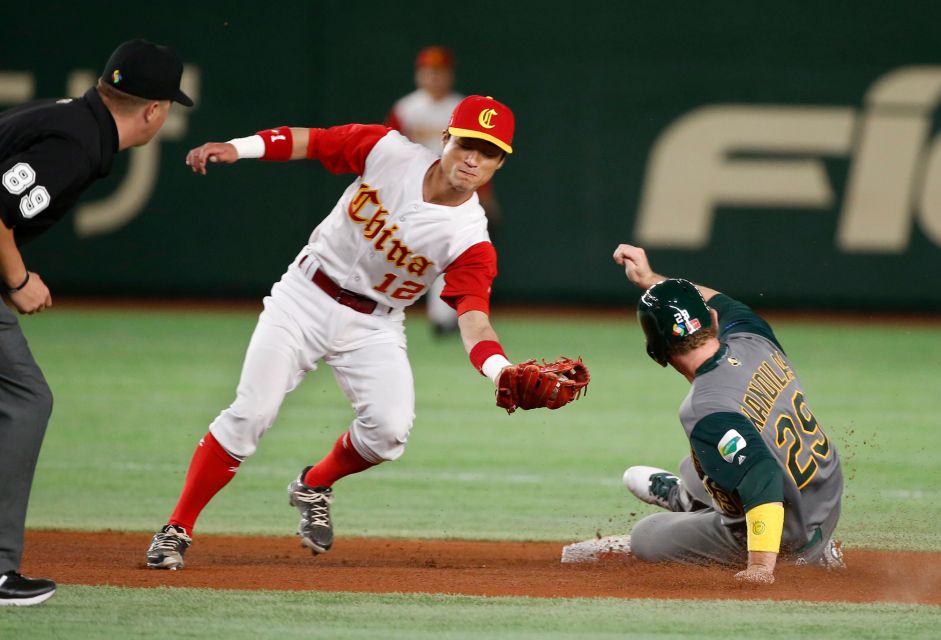
Breathtaking Who’s Got The Best Fit On The Biggest Stage? Ranking World Baseball Classic Uniforms Design Photography
Transform your screen with this vivid who’s got the best fit on the biggest stage? ranking world baseball classic uniforms artwork, a true masterpiece of digital design.
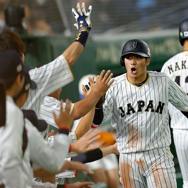
Mesmerizing Who’s Got The Best Fit On The Biggest Stage? Ranking World Baseball Classic Uniforms Capture Photography
Transform your screen with this vivid who’s got the best fit on the biggest stage? ranking world baseball classic uniforms artwork, a true masterpiece of digital design.
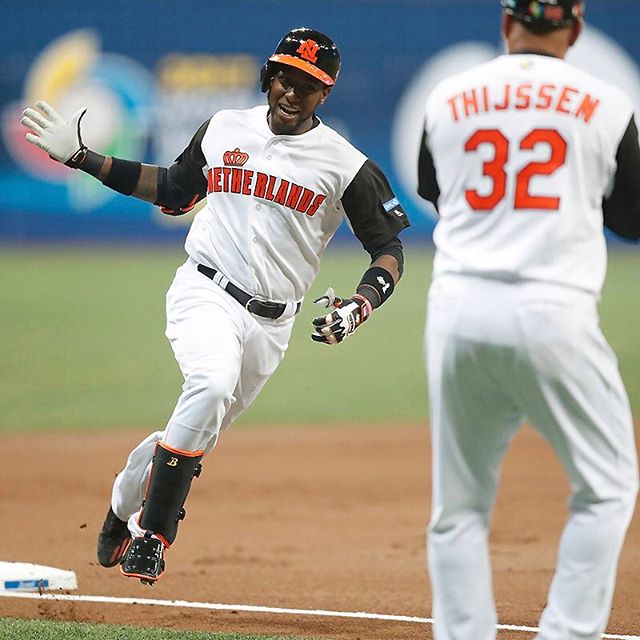
Serene Who’s Got The Best Fit On The Biggest Stage? Ranking World Baseball Classic Uniforms Abstract for Desktop
Transform your screen with this vivid who’s got the best fit on the biggest stage? ranking world baseball classic uniforms artwork, a true masterpiece of digital design.
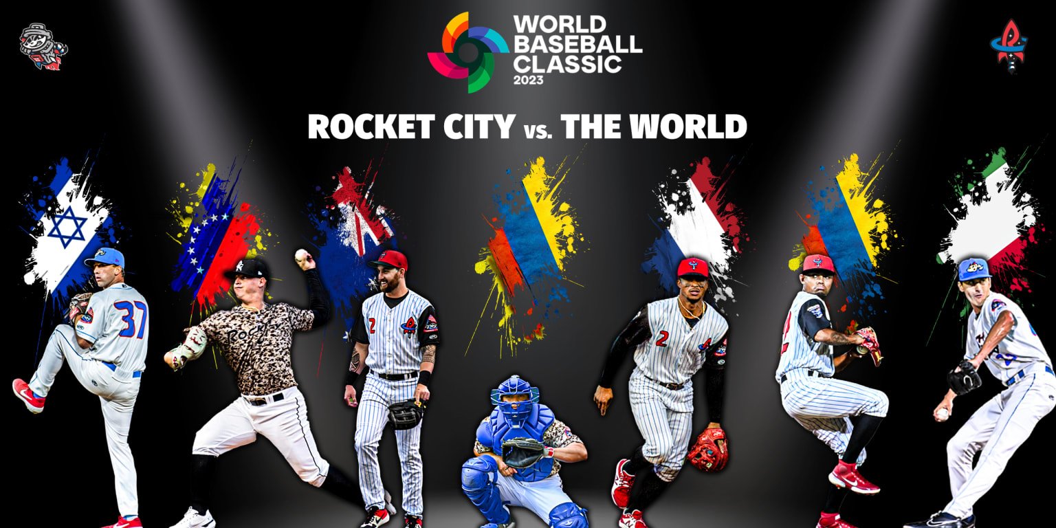
Artistic Who’s Got The Best Fit On The Biggest Stage? Ranking World Baseball Classic Uniforms Design Art
A captivating who’s got the best fit on the biggest stage? ranking world baseball classic uniforms scene that brings tranquility and beauty to any device.
Gorgeous Who’s Got The Best Fit On The Biggest Stage? Ranking World Baseball Classic Uniforms Wallpaper Art
Immerse yourself in the stunning details of this beautiful who’s got the best fit on the biggest stage? ranking world baseball classic uniforms wallpaper, designed for a captivating visual experience.
Lush Who’s Got The Best Fit On The Biggest Stage? Ranking World Baseball Classic Uniforms Picture in 4K
Immerse yourself in the stunning details of this beautiful who’s got the best fit on the biggest stage? ranking world baseball classic uniforms wallpaper, designed for a captivating visual experience.
Gorgeous Who’s Got The Best Fit On The Biggest Stage? Ranking World Baseball Classic Uniforms Artwork Concept
Find inspiration with this unique who’s got the best fit on the biggest stage? ranking world baseball classic uniforms illustration, crafted to provide a fresh look for your background.

Amazing Who’s Got The Best Fit On The Biggest Stage? Ranking World Baseball Classic Uniforms Landscape Art
Discover an amazing who’s got the best fit on the biggest stage? ranking world baseball classic uniforms background image, ideal for personalizing your devices with vibrant colors and intricate designs.

Breathtaking Who’s Got The Best Fit On The Biggest Stage? Ranking World Baseball Classic Uniforms Photo for Mobile
Explore this high-quality who’s got the best fit on the biggest stage? ranking world baseball classic uniforms image, perfect for enhancing your desktop or mobile wallpaper.
Serene Who’s Got The Best Fit On The Biggest Stage? Ranking World Baseball Classic Uniforms Landscape for Desktop
Discover an amazing who’s got the best fit on the biggest stage? ranking world baseball classic uniforms background image, ideal for personalizing your devices with vibrant colors and intricate designs.

Artistic Who’s Got The Best Fit On The Biggest Stage? Ranking World Baseball Classic Uniforms Landscape Digital Art
Immerse yourself in the stunning details of this beautiful who’s got the best fit on the biggest stage? ranking world baseball classic uniforms wallpaper, designed for a captivating visual experience.

Vibrant Who’s Got The Best Fit On The Biggest Stage? Ranking World Baseball Classic Uniforms Wallpaper Illustration
Explore this high-quality who’s got the best fit on the biggest stage? ranking world baseball classic uniforms image, perfect for enhancing your desktop or mobile wallpaper.

Detailed Who’s Got The Best Fit On The Biggest Stage? Ranking World Baseball Classic Uniforms Photo for Your Screen
Experience the crisp clarity of this stunning who’s got the best fit on the biggest stage? ranking world baseball classic uniforms image, available in high resolution for all your screens.

Beautiful Who’s Got The Best Fit On The Biggest Stage? Ranking World Baseball Classic Uniforms Image in 4K
Experience the crisp clarity of this stunning who’s got the best fit on the biggest stage? ranking world baseball classic uniforms image, available in high resolution for all your screens.

Serene Who’s Got The Best Fit On The Biggest Stage? Ranking World Baseball Classic Uniforms Landscape in 4K
Experience the crisp clarity of this stunning who’s got the best fit on the biggest stage? ranking world baseball classic uniforms image, available in high resolution for all your screens.
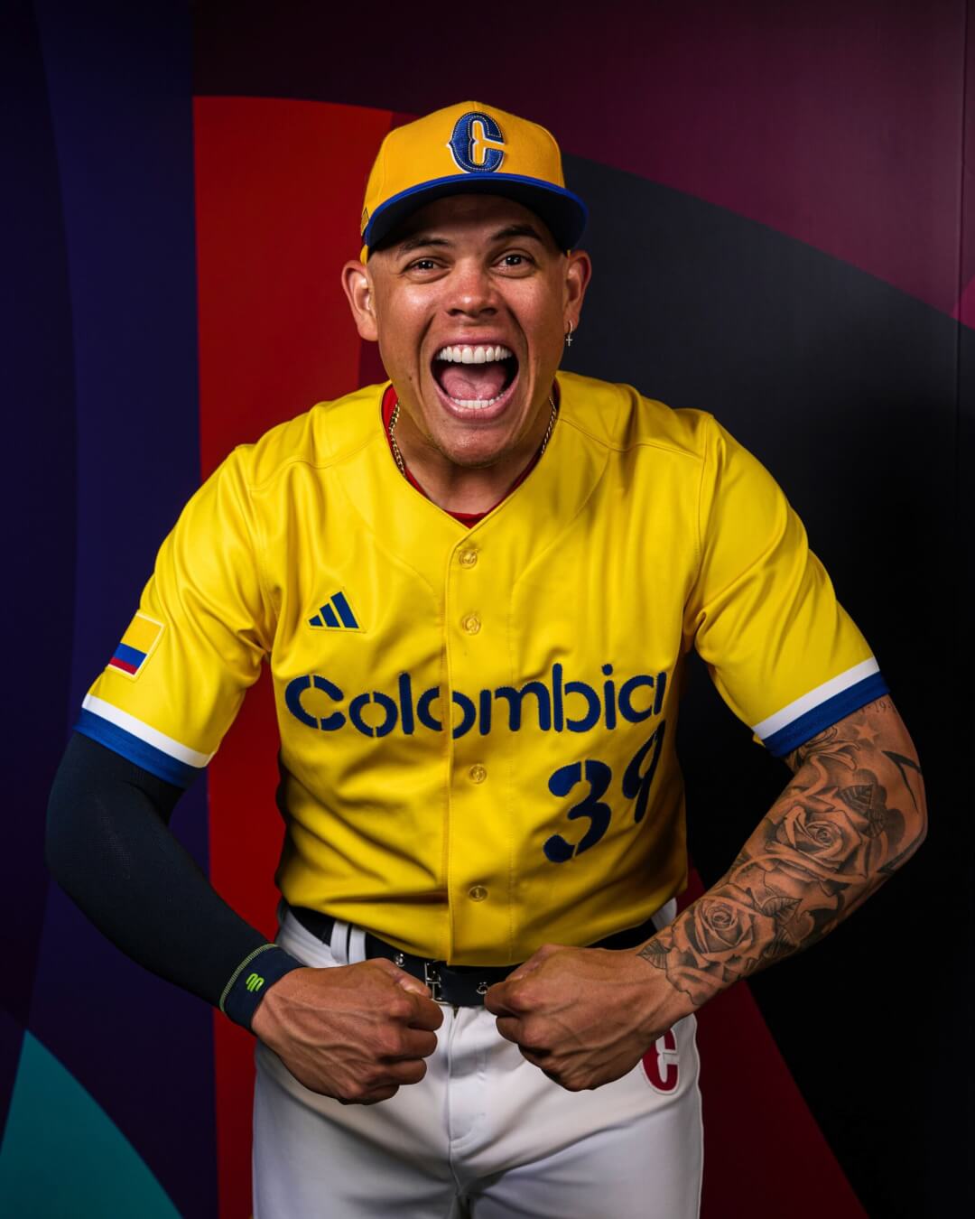
Vibrant Who’s Got The Best Fit On The Biggest Stage? Ranking World Baseball Classic Uniforms Abstract Concept
Experience the crisp clarity of this stunning who’s got the best fit on the biggest stage? ranking world baseball classic uniforms image, available in high resolution for all your screens.
Download these who’s got the best fit on the biggest stage? ranking world baseball classic uniforms wallpapers for free and use them on your desktop or mobile devices.